Tuesday, 15 December 2009
Character Design
Flash file: http://bananaman.fileave.com/Character%20Ideas%201.swf
Flash file: http://bananaman.fileave.com/Character%20Ideas%202.swf
Wednesday, 11 November 2009
Soundtrack Test
Quicktime file: http://bananaman.fileave.com/Items.mp3
Workflow
*Design a few characters and pick the best one.
*Design supporting characters?
*Design items which the character will collect along the way.
*Storyboard the characters journey through the game level.
*Begin animating the characters journey in Flash.
*Perfect the opening sequence and credits.
*Create a synth soundtrack using ABC.
Monday, 9 November 2009
Layout
Here i am looking at different layouts to give me ideas for my own. These layout are quite complicated whereas i was looking for something along the same lines done much simpler. I will need to create the entire layout before i begin any animating in Adobe Flash.
Opening Sequence
Flash file: http://bananaman.fileave.com/Animation.swf
Text Animation
Typographic animation showing words being typed out. I like how this looks and may use it in my final piece.
Pokemon Character Jumping
Flash file: http://bananaman.fileave.com/Pokemon%20character%20jumping.swf
Monday, 2 November 2009
Pokemon Character In Motion

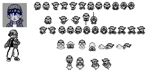
I used this Pokemon character as a template to see how i could create a pixel character and have the character appear as if he's walking. I did this using Adobe Flash.
Flash file: http://bananaman.fileave.com/Pokemon%20character%20walking.swf
Sunday, 1 November 2009
Super Mario World
Saturday, 31 October 2009
Title Sequence
Here i have been working on how the title sequence will look. I have chosen to do it in an old style pixel look which is influenced by "The Raconteurs", posted previously. I created it in Adobe Illustrator using a black square to make up the letters.

Title sequence with black and white colour scheme. I think i like this one best.

Title sequence with a green and black colour scheme.
Pokemon Red
Pokemon Red has old black and white style graphics which i like. It also gives me an idea of how a pixel character should look and how the character moves etc. I also like the tense, dramatic music which fits the game well.
The Raconteurs

Screen capture from The Raconteurs website which is designed to resemble old style computer graphics. I like the green typeface against the black background and the old style font used. I also like the beep noises when navigating around the website.
Source: http://www.theraconteurs.com/
Monday, 12 October 2009
Pixel Pandemonium
Super Mario Bros. stop motion animation made using cardboard cutouts. I like this way of doing things as it gives a more realistic look rather than flat 2D.
eBoy
m/m (paris)

I like how this character, by m/m (paris), is simple and childlike. I also like how the character is created using squares as well as the black and white colour scheme.
Source: http://www.mmparis.com/mm_posters.pdf
Super Mario Infinity II
I like how the game screen follows the character and how Mario has to get past obstacles in order to succeed.
Old Macintosh Games
I like how the Star Wars game is made up of a series of lines and dots. I also like the sound effects.
Monday, 5 October 2009
Super Mario Brothers
Super Mario Brothers game capture which has the old style game graphics which i hope to use. I also like the way the screen moves as the character moves. I may use this.
The IT Crowd
The opening sequence from The IT Crowd has an old computer graphics look which is the style i was hoping to go for. I like the fact that it was made in colour instead of black and white.
Monday, 28 September 2009
Donna Summer - I Feel Love
Again, Moroder uses synthesizers to create a hypnotic, immersive disco sound.
Giorgio Moroder - Chase
Giorgio Moroder uses synthesizers to create hypnotic, repetitive, electronic disco music which i think would work well against an old style game animation.
Thursday, 24 September 2009
Surf - Shadows
Surf advertisement which uses live action as well as theatrical shadow puppetry. The ad depicts a women travelling into the shadows where she has an adventure. She then returns to the real world. I like the clever use of shadow puppets to create the action sequences which would have otherwise been more difficult to film.
Kseniya Simonova - Sand Animation
Kseniya Simonova creates an animation in time to the music using only her hands and sand. I think it's interesting that as the music changes she creates a new animation on top of the old one. I also like the live aspect of the animation leaving no room for error.


